AC Protocol & Rule Expected Soon
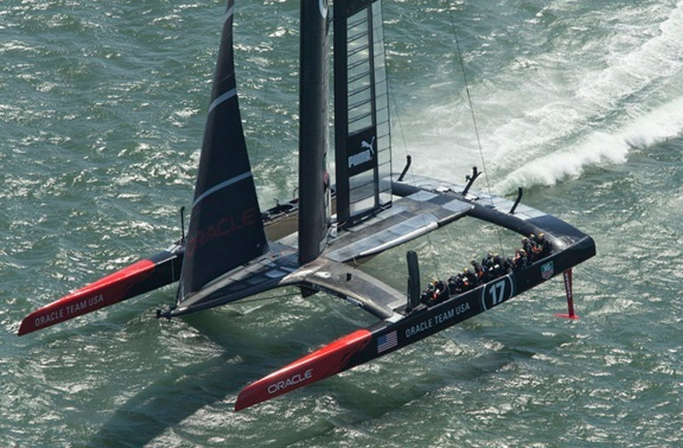
The protocol and class rule pertaining to the 35th America’s Cup is on schedule to be released in March. The new rule is expected to "produce a foiling, wingsailed catamaran in the 60-65 foot range," according to the America’s Cup Event Authority (ACEA).

The design team Morrelli & Melvin is working in conjunction with a number of potential AC teams to develop the upcoming rule.
The protocol, "which defines rules specific to this event," is expected to be released in March as well. "We’re working with the Challenger of Record from Hamilton Island Yacht Club to have a Protocol ready to issue in March," said Russell Coutts, Oracle Team USA’s CEO. "An overriding theme of both documents is an effort to reduce costs and increase media exposure, so that teams can provide a better return to their sponsors for significantly less money than was required last time."

As ‘Lectronic recently reported, the venue for the 35th America’s Cup will not be announced until later this summer in part because the City of San Francisco has not agreed to the same terms and conditions used in the AC 34 agreement with the ACEA. "We need to take the time to assess each potential venue and ensure we get the best possible outcome for the America’s Cup, the teams and the event commercial partners," Coutts said.
Aging Eyes & Tiny Print
As you may have noticed, the current edition of Latitude 38 has a slightly new look, as we’ve changed printers. We hope you’ll agree that the photos ‘pop’ a bit more, and the overall print quality has improved (despite some minor problems with the cover).

©2014 Latitude 38 Media, LLC
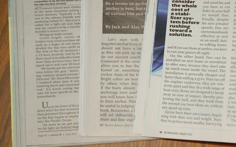
One issue that was discussed during the run-up to the printer change was our type size: 8.5 point, as opposed to industry standards of 9, 10 or larger. We invited ‘Lectronic readers to chime in on the debate, and they came back with a variety of strong opinions.
Many readers urged us to "bump ‘er up a tad," as Paul Savage put it:
"Pls make it bigger! In poor light many articles get skipped! — Gale Plummer
"My aging eyes and I vote in favor of larger fonts." — Bill Sikich
"The standard is 13 point for letters and correspondence. Please go larger. The publication will look better, you’ll just need a few more pages. Anyway, trees are renewable. Eyesight (as well as hair) is not." — Bob Braid
"I predict everyone will want it larger and darker." — Craig Leweck
But many others urged us to stick with current type size and format, often citing fears of sacrificing content if we were to up-size:
"Naah…. the difficulty seems to be reading the credits running vertically: you just need a bit more neck flexibility…. Hot yoga, or swan or flamingo vertabrae implants?" — Nick Brand
"Do I want bigger typeface in exchange for less content? Oh sure, and please throw in some white space to further dilute your product. Seriously, only a value-driven publisher such as Latitude would even ask its readers preferences. But, no thank you, we’d prefer content." — Cliff Smith
"My eyes will soon turn 70, and I use reading glasses for anything nearer than two feet, which of course includes all printed matter, but I have no issues reading your fine publication as currently printed. Thanks for asking!" — Bill Crowley
"Funny, I was late picking up my copy of Latitude at West Marine yesterday, but as I was walking to the car I was thinking to myself that I will soon just not make the trip, because as I get older the hard copy gets more and more difficult to read, even with my 250’s. I don’t know if it’s the font size or the type of paper, but truly it’s my issue not yours. I’m 66. That’s not your fault. We have it online and can blow it up to whatever size we like, right? I for one say don’t change a thing for me. You could, though, bring back the occasional topless beauty hidden discretely somewhere in the mag. That would help my vision considerably. — Guy Johnston
After digesting a wide variety of opinions, we’ve decided to keep the type size the same. As for the lack of topless beauties, you can blame political correctness for that. Believe it or not, we never set up those shots. Back in the pre-PC days (that some might call the good old days), women would occasionally send in sexy photos of themselves with obvious pride that they were physically fit, good looking and in their prime. That rarely happens these days, even though we still have no objection to celebrating Mother Nature’s handiwork.
