
Max Ebb — In Praise of Raster
One of the lost pleasures of planning a trip to a new sailing area was rolling out the new charts. A physical chart that covered most of the dinner table evoked the adventure, the hazards, and the rewards of a cruise. But times have changed. The charts are digital, and the largest chart is only as big as your screen.
Our local sailing school and its affiliated “club” were planning a charter flotilla, and tried to get around this limitation by projecting the charts on the big screen in the yacht club bar. Lee Helm, naval architecture grad student and ace navigator, had been tapped to help with the navigation lecture — especially the nuances of digital charts. Many of these sailing-school people are more or less novice cruisers, despite their age. “Seems a shame that they had to wait till retirement to learn to sail,” I often thought. But this class was pretty sharp, and some of them had been sailing back in the day.
“Digital charts have, like, more info, but you have to take some time to learn their care and feeding,” Lee began. She stopped for questions after a few charts of the flotilla cruising grounds were projected on screen, with various options turned on or off.
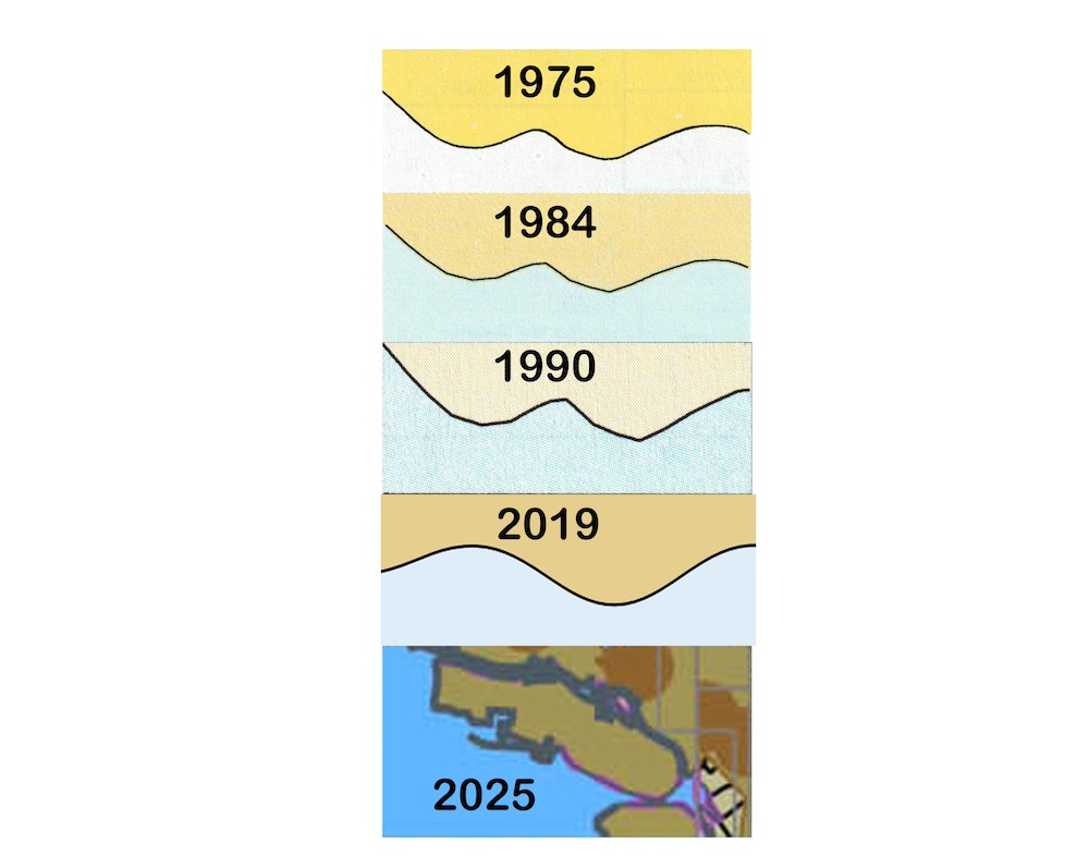
“I miss the color of land in the old paper charts,” one of the older-sounding voices in the darkened room remarked. “The charts used to show land as bright yellow, like the color of a sandy beach in sunlight. Made me really look forward to going there.”
“Me too,” another cruiser waxed nostalgic. “It was in the mid-’70s that they took away the sunlight and went to a dull shade of yellow. Then to an even duller tan color, supposedly to conform to international standards.”
“And now the digital charts paint the land with a color that looks like abandoned industrial shoreline,” complained another sailor. “Not that that isn’t what a lot of our urban shoreline actually is, but still, the color choices should make the charts appear to describe places we want to sail to, not Superfund sites.”
“Standardization, like, reduces errors,” Lee tried to defend the digital chart conventions. But the room was clearly not with her. “Forget the aesthetics; you have to be very careful with the zoom level,” Lee continued, trying to stay on topic. “It’s like, an artifact of adapting the charts to small screens. Zoom out too far, and hazards can disappear from the map. Zoom in and you can lose track of the overall navigation strategy. Zoom out again and you have to deal with overlapping text and other kinds of clutter.”
“Wasn’t there a round-the-world racer who put their boat on the bricks because their chart was zoomed out too far?” asked a younger voice in the group.
Read.