
Earth Wind Map Is Beyond Cool
©2014 Latitude 38 Media, LLC
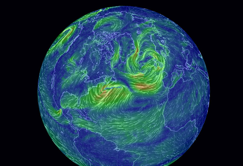
The Information Age has been a boon to mariners in more ways than we can count, providing innovations such as GPS, chart plotters, AIS and GRIB files, all of which greatly enhance the safety of travel on the ocean. But a new graphical development called the Earth Wind Map has set a new standard for combining fascinating imagery with (near) real-time wind information. Check it out and we think you’ll agree that the ‘wow’ factor is off the chart.
Developed by software engineer Cameron Beccario from data gathered by the US National Weather Service’s Global Forecast System, the interactive map allows users to monitor wind patterns virtually anywhere on earth. The Google Earth-style display lets you adjust the globe’s image to pinpoint any spot on the planet. Data is updated every three hours.
While flow patterns indicate wind direction — almost hypnotically — all over the planet, a subtle color scheme indicates wind strength, with gentle breezes represented by thin green lines, stronger winds by bright yellow, and extreme winds by red.
©2014 Latitude 38 Media, LLC
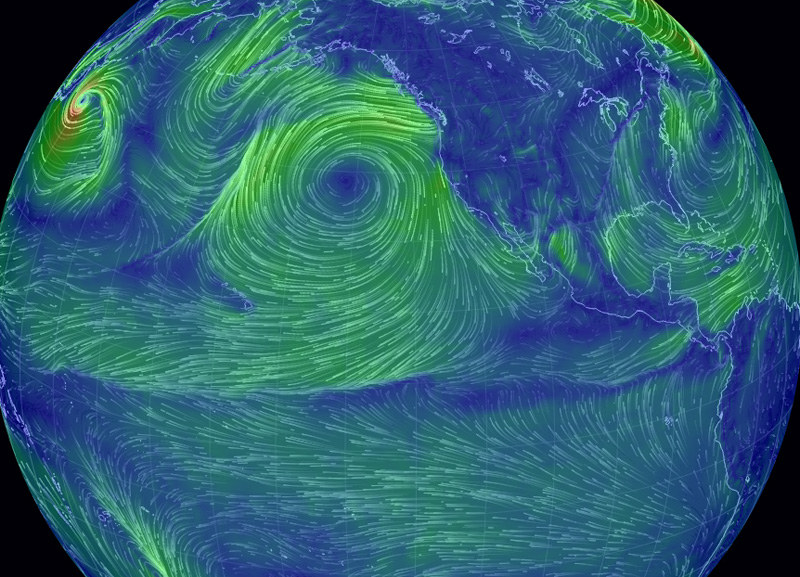
One look at the central North Pacific and it will be obvious to you how all that rubbish ends up in the North Pacific Gyre. And why Tahiti-bound cruisers need to pick their route carefully as they head west. On the opposite side of the globe, you can see how Columbus easily found his way to the West Indies — and how he made it back to Europe on a contrary wind pattern with relative ease. Today, specifically (top photo), you can see a graphic depiction of that big nasty system that’s currently hammering New England.
Despite what we think about many government expenditures, the National Weather Service’s work certainly represents money well spent — especially in the hands of a visionary like Beccario.